Tokens as the source of truth
Color, type, spacing and radii defined once, synced between Figma and code, themeable in minutes.
Design · Design Systems
Build tokens and reusable components incrementally, then maintain the system as new features and interface needs emerge. Your $1,499/month AI Product Team includes planning, implementation and human review, with one active priority.
What We Build
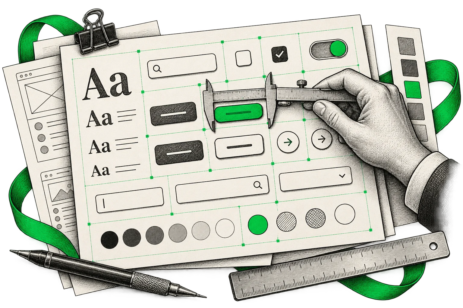
Color, type, spacing and radii defined once, synced between Figma and code, themeable in minutes.
A Figma library and matching React components with variants, states and accessibility built in.
Usage guidance, do-and-don't examples and live previews, so the system answers questions before Slack does.
Migration plans, linting and reviews that get the system into production screens, not just a showcase file.
Part of your product subscription
Design, web and mobile development, releases and analytics setup. One agreed priority in progress at a time.
$1,499/ month
Explore everything included Founding client pilot. Code you own.Implementation, testing and experienced engineering review in one team.
We organize your backlog, agree priorities and keep you up to date.
Release an agreed milestone, measure what matters and choose the next move.
Tools & deliverables
Design and code kept in lockstep, from tokens to shipped components.
How We Work
Review the current UI and agree the component or consistency issue with the highest practical value.
Set the relevant tokens, states and accessibility requirements, then plan the next component milestone.
Develop the agreed Figma and code components with examples, tests and human review.
Support adoption, review how the components are used and prioritize the next system improvement.
Our Work
Your next idea, one clear milestone at a time. An AI product team, human review and project management for $1,499/month.